Top Service Lines
The Top Service Lines section offers an at-a-glance breakdown of the most commonly used service lines at your facility. This section is profiles-based, so you can select your profile and period of interest in the dropdowns; the Period defaults to the Scorecard Time Period displayed at the top of your screen.
There are two parts to the Top Service Lines section: the table and the pie chart.
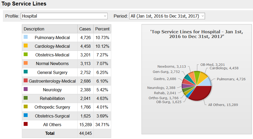
Top Service Lines table
The Top Service Lines table lists the Service Line, as well as the number of Cases (encounters) and the percentage of discharges this Service Line accounts for. The colored square to the left of the Service Line Description matches the corresponding pie chart sliver. For comparison, the bottom row of the table indicates the volume and percent of encounters from any other Service Line, as well as the total volume of encounters in the profile.
Top Service Lines pie chart
The labeled pieces of the pie chart correspond to the Service Lines in the table. The label includes an abbreviation of the Service Line and the volume of encounters from the Service Line. The colors match the squares to the left of the Service Line Descriptions. Hovering over a piece of the chart reveals a pop-up box containing the Service Line Description, volume of encounters for the Service Line, and percent of discharges with the same Service Line.
